Thursday 30 April 2009

hmm... deadlines, posters, and confusion

One of my sources in the eca Jewellery department is quoted as saying "Degree show crunch time has hit ECA hard" (Fools Gold, 2009), but I have not realised any change... The animation department is near empty, and I still feel little stress).
There is only 15 days until the assessment deadline, and like my source at Fools Gold I got nothing done yesterday in terms of studio work. Instead I spent all day doing things that I don't remember, but which seemed important at the time, and then I stayed up all nite (from midnight-7am) trying to create the first version of my film poster for the eca Design school degree show catalogue (which nobody has been given definite instructions for)... Last nite I was aware that our image for the catalogue had to be 30cms tall at 300dpi and in portrait format, which therefore renders all my animation stills useless as they are only 12cms long at 150dpi and in landscape format). I therefore made what seemed like a sensible decision, and decided to create my film poster now so that it can be used for this catalogue as well as for the degree show exhibition.
I created my poster in a painted/design style inspired by classic film posters such as Jules et Jim, Les Quatre Cents Coups, Casablanca, Contempt, La Fiancee du Diable, La Strada, Nosferatu The Vampyre, Questa e La Mia Vita, The Trouble With Harry, and especially Psycho)... Below is my poster design as it currently looks, but I'm going to improve the fonts, repair the badly Photoshopped painting, and hopefully add more useful names to the list on the right hand side at a later stage...

After spending the best part of 9 valuable hours over two days on this poster for the Design school degree show catalogue, I received an e-mail from staff stating that there is a possibility that we, as filmmakers, may be getting permission to use our native landscape format instead of being forced into a portrait format - but we will find out for definite tomorrow (which seems a bit daft, after all that is just a day before our original catalogue image hand-in deadline)! If the powers that be decide to change their minds about the format of our pictures, it means that the time I spent making my poster was a waste of important rotoscoping and sleeping time (cos my workload obviously isn't yet stressful enough for me to go completely without sleep until the deadline)...

Tuesday 21 April 2009

Persepolis

I watched Persepolis last week when it was broadcast on TV, because I had heard a lot of good things about the film. But I've got to say that I'm really disappointed. I just don't understand the fuss about this Oscar-nominated animated feature film, and therefore I would like to recommend a short animated film based upon similar themes that I found to be much more effective - Maryam Mohajer's And Life Went On.

Persepolis seems like a film trying to tell other people about the terrible impact war & revolution had on their lives; and although small parts of the film are quite effective at this, for me the story just dragged on and on for way too long with major parts of weak material, which ruined any impact that the shorter parts had.


On the other hand, Maryam Mohajer's And Life Went On is a short animated film, that uses a simple plot to effortlessly evoke very powerful reflections about the impact of war within the mind of the viewer.
It is a 6 minute film made at the Royal College of Art in 2007. The story is set in Tehran during the 1985 Iran/Iraq war, but I don't want to give away any more of the plot than that because when I saw it at the McLaren Awards in the Edinburgh International Film Festival 2008 I knew nothing about the film.
While I was watching And Life Went On at the Filmhouse I thought that the story was progressing slowly and felt quite mundane (just like Persepolis),but here (in this short 6 minute format),it works much better and genuinely built the film to a powerful climax.
I would even go so far as to say, albeit controversially, that And Life Went On was as effective as Saving Private Ryan for portraying the devastating effects of war!

Sunday 5 April 2009

A mine of design

While drawing a new PoV shot for my film over the last two days I've spent even more time on the Internet looking for design influences... I just couldn't help myself - i love 'research'!
Over the last two days I've found so many wierd and wonderful things!!! Here's a round-up...

WebUrbanist is a great resource with loads of databases of very unusual things... One such database is 20 Unusually Brilliant Bookcase & Bookshelf Designs.

WebUrbanist also had these evocative databases collectively known as The (WU)ltimate 33-Part Guide To Abandonded Cities. I found it really useful for ideas to develop the spooky run-down aesthetic designs of the house in my film.

Another similar link is at Askville where people replied to a question asking 'What defines a house as spooky or haunted?' Although most of the answers are fairly common, it also has a few really unusual answers, and lots of good imagery and related links.

I found this blog post about Weird Chairs called That's What You Call Pain In The Ass. There are chairs made from cutlery, sharpened pencils, screws, and even featuring 3 sheep heads! But this set above, designed to look like a child's drawing, is my favourite.

Opera78 is a design board established in 2005 by Fiodor SUMKIN, and has lots of cool illustrations.

Tim Sale is the graphic novel illustrator who creates the artwork for Heroes. I just checked back on his website yesterday for the first time in ages, and forgot how great his work looks.

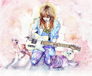
Earlier this evening I saw the advert for Ladyhawke's debut album on the TV, and it looks so awesome! It has wonderful watercolour illustrations and the coolest rotoscoping I've ever seen!
I checked out the music video for My Delirium on YouTube... It mixes live-action with the really cool rotoscoping and even has long sequences of animation created by digitally manipulating a series of watercolour paintings.
The illustrations and paintings were made by Sarah Larnach. And her watercolour paintings were turned into the awesome animation sequences by Frater at Partizan Lab.

Wednesday 1 April 2009

Some backgrounds for my film

I survived my "acting" debut on Monday, and despite being the director I've not yet seen any of the footage... The whole process actually went really well, but I doubt I will be challenging Heath Ledger or Anthony Perkins for the most convincing psycho award.

Over the past week I have been adding coloured backgrounds to my rotoscoping. I've never had the opportunity to do precise backgrounds for character animation before, so this is something new to me, but it works well enough so far... My only concern is that the backgrounds look pretty flat, although if I have the time available I will manually add more depth with blur and focus frame-by-frame in Photoshop, which should really enhance the images. In the meantime here are some of my first backgrounds...